Dust flux, Vostok ice core

Dust flux, Vostok ice core
Two dimensional phase space reconstruction of dust flux from the Vostok core over the period 186-4 ka using the time derivative method. Dust flux on the x-axis, rate of change is on the y-axis. From Gipp (2001).

Friday, September 30, 2011

Recognizing change in complex systems part 3: Unemployment and real interest rates

This post is for those who still think that lower interest rates will lead to lower unemployment.

Information comes from Bureau of Labour Statistics and the Fred. Strangely, the historical data from the BLS does not match the data downloaded from the same site some months ago for previous posts on this topic--the differences are about 0.7% (i.e., the recent correction reduced the unemployment rate by 0.7% for December 2010).


The scatterplot of real interest rates (which is calculated by subtracting the official inflation rate calculated from CPI data for all urban consumers including all items--annualized and smoothed through a 3-pt MA--from the 3-month treasury yield) against unemployment rate shows two distinct areas of Lyapunov stability in phase space. These are separated by a brief (four month) excursion into relatively high real interest rates. The lower-unemployment region of phase space is occupied from January 2001 until August 2008.

Notice that there is no discernable correlation between unemployment rate and interest rate. I recognize that this observation based on possibly manipulated data sets is at odds with the axioms of Keynesian economics and therefore should not be discussed.

The system experienced a bifurcation in late 2008. When real interest rates fell in late 2008, unemployment unexpectedly rose and the system settled into a new area of stability, where it has remained since.

The policy of frantically lowering interest rates has failed to bring down unemployment because of a fundamental change within the economic system. Continuing to hold interest rates low will not undo the irreversible change that occurred in 2008. It might be a good thing to spend some effort on understanding the dynamics of the economic system rather than continuing with actions based on axioms that are clearly at odds with the actual universe.

I recognize that the idea of the economic system undergoing fundamental changes to its dynamics is at odds with the axioms of Keynesian economics and therefore should not be discussed.

Feedback is a common feature of dynamic systems. In certain dynamic systems, there are areas of phase space where the system is dominated by negative feedback. Perturbations to the system are resisted. If the perturbation is large enough, however, the system may enter a state wherein positive feedbacks are dominant, in which case the system evolves rapidly through phase space until it arrives in (usually) a new area of phase space, where once again negative feedbacks dominate and the system regains some form of stability. These areas of stability are sometimes described as attractors, but for reasons discussed previously, we prefer to describe them as areas of Lyapunov stability.


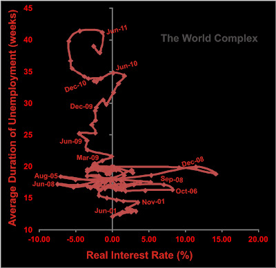
A similar change is observed in the plot of unemployment duration vs real interest rates, once again covering the period from 2001 to present. Notice that the average duration of unemployment actually shows no correlation with real interest rates.

Observing the change is easy (if we disregard Keynesian axioms). Deducing the nature of the change is more difficult.

One observation that leaps out at me is this. Real interest rates fell to an extreme low in August 2005, followed by an extreme high in October 2006. They fill to an extreme low in June 2008, and rose to an extreme high in November 2008. In the first case, there were no dire effects on unemployment. But the second time around, we got a bifurcation.

Is the answer here?

House prices were still rising in late 2005. They were falling in late 2008. Perhaps a fluctuation in interest rates when people believe they are becoming more wealthy is not harmful, but one that occurs during a time when our perception of wealth is falling led to a massive loss in confidence. Or at least a sudden realization that we couldn't afford all this debt.

If the change in economic dynamics is caused by a sudden negative perception of debt, then manipulating the interest rates downward will not and cannot bring us back to a paradise of low unemployment. Particularly if it is accompanied by declines in the Case-Schiller index and the stock market.

Tuesday, September 27, 2011

Recognizing change in complex systems: excursions vs. bifurcations

Continued from last time.


Once again, we have a fifteen-year plot of gold/copper ratio vs. silver/rough rice ratio. We are continuing our discussion of whether the event labelled C, which is still unfolding, is likely to be an excursion (which will then return to the region populated by most of the graph) or a bifurcation (which will lead us to a new area of Lyapunov stability somewhere new in phase space).

It appears to be at least a once-in-a-generation event. But how significant is it?

For this spike to represent a bifurcation as opposed to an excursion, what we would have to see the function settle in around a new area of phase space. Looking at the shape of the spike, the likely area for such a new area of stability will be centred near the "C", and could extend from the far right of the graph to the kink in the curve near (350, 1.5). For this to form with any degree of satisfaction is likely to take about two more years. If we don't see any sign of orbiting about the "C", then the most likely outcome is a return to the 15-year area of stability.

I found it interesting that on this graph, the silver spike of 1998 does not appear. It is lost in the middle of area of stability.

Is it possible that the late spike in silver is due to its comparison to a soft commodity, which perhaps haven't performed as well as metals? We can check this by changing our ratios slightly.


Same four commodities--but compared differently. This time we are looking at the silver($/oz) to copper ($/lb) ratio against gold to rough rice. There are three significant excursions, labelled A, B, and C.

Excursion A represents the spike in silver price in 1998 due to the Warren Buffet purchase. Excursion B is the rise in price in copper in 2006, which exceeded (in percentage terms) the gain in silver which occurred at the same time.

Excursion C has two phases. For the first six months or so, the excursion is dominated by increased gold prices (compared to rice), and for the last 13 months or so, the excursion records the outperformance of silver.

Once again, we won't be sure that this is a bifurcation as opposed to an excursion unless the phase space settles somewhere near or above the "C" for at least another two years.

- - - - - - - - - - - - - - - - - - - - - - - - - - - - - - - - - - - - - - - - - - - - - - - - - -

It is obvious gold has not behaved well lately. Some of the stocks have been hit as well. We haven't looked at Detour Gold Corp. for awhile.


The recent price action has mirrored that of gold, with a sharp rise from the end of July and a sharper decline in the past few trading days.


The two-dimensional reconstructed phase space of the last eight months of the price of DGC-T.

The phase space portrait occupies a Lyapunov-stable area at around $30 for about six months, and from the beginning of August, the system evolves towards the $37 area. The system completes an orbit in the $37 range before leaving the area. This behaviour suggests that there may be another LSA in the $37 range, but I would feel more comfortable with it after a few more orbits.

What happens next? The two most likely scenarios would appear to be a return to the $30 LSA, or a return to the incipient LSA in the $37 range. Being long Detour, I would be encouraged by a reinforcement of the $37 LSA. Unfortunately, this outcome is nearly impossible. The reason is in the nature of the construction of the graph. Recall that the phase space reconstruction is generated by the price at closing of a particular day (on the vertical axis) against the closing price four trading days earlier (horizontal axis).

The coordinates of the last point are ($37.60, $31.00). In four days, the value of the x-coordinate is going to be $31 (today's closing price). In three days, the value of the x-coordinate is going to be $31.17 (yesterday's closing price). I don't know what the closing price of Detour will be on those days--but if it is at about the current price, then the state will lie within LSA30. The only possible hope for the Detour price state to reach the orbit at $37 would be for the price to recover to about $37 within the next three trading days--by Friday. Even then the state would not lie within LSA37, but at least the trajectory would indicated that that would be the likely outcome.

In fact, if we don't see some reassuring action tomorrow--when x falls to $33.60--we will be right on the outer edge of LSA30.

There is another, less desirable outcome. The price may continue falling to the previous LSA near the $23 level. Doh!

- - - - - - - - - - - - - - - - - - - - - - - - - - - - - - - - - - - - - - - - - - - - -

Time to liquidate more cocoa. Sadly, the good Ghanaian stuff is all gone. I am forced to take the South American stuff. But I can at least sweeten it a little with this.


Saturday, September 24, 2011

Recognizing change in complex systems

"So I came downstairs and was surprised to find the dog reading the paper."

Such is the beginning of a typical shaggy dog story. If the story is true to form, the punchline would be something like the dog has been getting his news from the internet for years, or some such. If this were a true story, it would be that the dog is usually sleeping when I come downstairs. In such a case, I would presumably notice right away that the dog's behaviour was unusual.

One of the outstanding problems of complex dynamic systems is recognizing (hopefully in real time) when a change in behaviour is occurring.

Today we look at the long (ish)-term behaviour of some commodities with respect to one another. I haven't thought much about their economic significance. Today will just be arm-waving at charts, with a view to see if we can recognize the presence of change in the market fundamentals.

First up--some soft commodities. Below we see the ratio of cocoa prices to rough rice (contracts as defined in 1996).


The principal impact on the graph is from the first Ivoiran civil war. I find it interesting that the second war didn't really impact the price as much. Possibly this is because of rapidly increasing Ghanaian cocoa production. According to Voice of America, Ivoiran production is doomed due to years of under-investment.

The reconstructed phase space appears below. I have used the time delay method. To construct this figure I have smoothed the above data set through a 3-pt moving average filter, as the unfiltered data looked really noisy.

The fifteen years of data are confined to a comparatively small region of state space, with the only interesting feature the large excursion during the first civil war. This event lasted about two years. Note the magnitude, and more importantly, note the outcome--the system reverted back to the same area of phase space from which it began.

The second civil war by contrast is scarcely noticeable.

There are other ways to contruct phase space portraits. Instead of reconstructing them from a single time series we can build them from scatterplots of two (or more) time series. In studying geological systems I try to avoid this technique because it is difficult to build two time series of equivalent length and similar sample rates. For commodity time series this is less of a problem.

So let's go all out and plot the gold/copper ratio against the silver/rough rice ratio (all month-end closing prices).


IIRC, I have multiplied the silver price by 100 in the above chart. Silver and gold used $/oz, copper measured in $/lb.

Notice how for most of the fifteen year record, the states all plot within a relatively large oval (let's call this an LSA) within phase space. There have been three significant deviations from the LSA over the past fifteen years. The excursion marked A represents the strength in gold during the 2008-9 global meltdown. The excursion marked B is a rise in tandem of both silver and copper during the year 2006.

The last excursion (C) represents the recent rise in silver. This ongoing excursion appears to have lasted 17 months so far. The multi-billion dollar question is whether this is an excursion expected to revert to the  LSA, or has a bifurcation occurred, with the system evolving towards a new LSA somewhere else in phase space.

Refer once again to the phase space plot of cocoa/rough rice.

Bifurcations and excursions are both rare events. The excursions occur on at best a decadal scale. Bifurcations are more rare. Clearly they have happened in the past. For instance, the long-term gold/silver ratio was approximately 16 for centuries, but has not been near this ratio for several decades. A bifurcation occurred in the last century sometime. Perhaps we are in one now. Either way, I think it might be prudent to stock up on rice.

Disclosure: long gold, long silver, long copper, long cocoa, long rice. Sadly, I was forced to liquidate some of my cocoa holdings in the recent market turbulence.


But it was comforting.

Update (April, 2012) - I overlooked this story in the explanation for the rising price of cocoa in 2010. It seems to fit in with the first peak in the cocoa/rice ratio in 2010.

Friday, September 23, 2011

Market declines

What's it all about?


European markets at least seem to be declining on low volume. Is this all due to major players pulling their bids? Perhaps they are sending a message to the political realm. Certain individuals who may shortly seek re-election may be under pressure to change.

Thursday, September 22, 2011

Information theoretic approaches to characterizing complex systems, part 4: Formalizing a method for optimizing window lengths for probability density diagrams from phase space

When the market looks like it does today, it is better to think about other things.

Some time ago we began looking at the problem of determining the optimum window over which the probability density of the phase space should be calculated. The problem is essentially one of optimization, where if the window is too short the probability density plot will not be accurately represented, but if it is too long, then interesting features may be smoothed out.

Once again we look at a > 2 million year proxy for the strength of the Himalayan paleomonsoon (top figure).


Reconstructing a phase space portrait over small (say 30 thousand years) intervals gives us highly variable results because of the variability in the dynamic behaviour of the system over comparatively short timeframes. As we have seen elsewhere, many of these complex climatic systems are characterized by intervals during which the state space is confined within a comparatively small area of Lyapunov stability, interspersed with intervals during which the system evolves rapidly towards another area of stability.


While confined within an LSA, the probability density will consist of a few large values spread over a small area. The entropy (in an information theory sense) will be small.

When the system is evolving towards a new LSA, the probability density will consist of many small values spread over a large area. The entropy will be large.

Successive values of entropy calculated over small time windows will show a lot of variability. Some of that variability will be due to secular changes in the complexity of the system, and some will be due to the granularity of our observations. If we start choosing longer time windows, we get tend to get both episodes of stability and bifurcation within each window, so the effects of granularity ideally vanish and only the secular variations remain.


Variability declines as the window length increases from 30 ky (thousand years) to 150 ky. Now, each of the above graphs consists of a string of data, so we can do better than eyeballing a comparison.

The methodology proposed then is to normalize each of the strings of data above, and then compare the zero-lag cross-correlation of the entropy of two successive window-lengths to the zero-lag autocorrelation of the entropy observed in shorter of the two windows.

For instance, in the figure above, the entropy observed over 30-ky windows varies from about 1.5 to 3.5. We normalize the data by dividing the difference between each observation and the mean of the series by its standard deviation   i.e. x(norm)= (x - mean)/(standard deviation)

We similarly normalize the entropy values for the 60-ky window. The zero-lag cross-correlation will have a lower value than the zero-lag autocorrelation--but how much lower is a measure of how different the two curves are. We find that the ratio of the two values improves as we look at longer windows, as below.


The graph converges in the general direction of the value of 1 as the window gets longer. A value of one would imply perfect correlation between the two entropy functions. So we choose the window length for which the zero-lag cross-correlation is sufficiently high for our purposes. In the example above, I would find that the 150 ky window is sufficient.


For the late Quaternary, a window length of 150 ky also appears suitable.

I'm pretty sure that the different rates at which the cross-correlations approach 1 in the Late and Early Quaternary paleomonsoon proxy are telling us something about the dynamics of the system over these two intervals--but I'm not yet sure what.

Wednesday, September 21, 2011

A brief comment on the growth of wealth in US history

One factor I neglected to mention the last time that was critical in the expansion of the wealth of the United States was the escalation of land values through development. In particular, homesteading, by which families were permitted to stake out areas of wilderness and through their efforts of clearing, draining, and raising crops, made it theirs.

Overlooking for the moment arguments about the environmental value of wilderness, and the fact that much of the land was not quite as empty as stated, you have to admit that this process created a lot of wealth. It was the creation of real wealth that led to the growth of America's economy; and not the projection of power worldwide through unlimited issuance of debt instruments favoured by Johansen and Simonsen (and Bernanke and Geithner and Krugman et al.).

Monday, September 19, 2011

Brilliant discovery in economics: A review of Johansen and Simonsen (2011)

This paper shows the kind of brilliant research that gets done now that economic commentary is only pursued by Ph.D.s.

In this paper, Johansen and Simonsen (2011) come to the surprising conclusion that (spoiler alert!) the US economy operates on Keynesian principles; which differs significantly from its official policy of creating credit whenever a problem appears.

The principal evidence offered in support of the author's conclusions is the following chart, showing that both the value of the Dow Jones Industrial Average (DJIA) and the amount of public debt have increased logarithmically since the late 18th century. And since correlation implies causation, the rise of the DJIA must be due to the increasing public debt.

Correlation between DJIA and U.S. public debt. From Johansen and Simonsen (2011).

Now that we understand how the economy works, it becomes clear how we move forward. Raise public debt. Boost the DJIA! The trickle down effects on the economy shall enrich us all.

Notice how public debt jumps at particular intervals--especially around 1812, 1860, 1914, 1940, and steadily after about 1965. These increases in debt relate to wars, proving the Keynesian adage that war is good for the economy.

Of course there might be a few other variables that increased over the same time, which might also contribute to that rising DJIA.

Population increased, as did infrastructure construction and economic activity. Might these factors have influenced the DJIA? Most of that economic activity had nothing to do with wars, but did have a lot do with increasing the American standard of living.

Probably the most important factor is the increased availability of cheap energy.

Looking at the chart again, I worry a bit about that last increase in the DJIA just before the end of the chart. Looks like it's about 5x more expensive than the historical trend. Quick! Somebody borrow more money!

Reference:

Johansen, A., and Simonsen, I., 2011. Keynesian Economics After All. Submitted (but they don't admit where).

Sunday, September 18, 2011

Poor Gordon Brown . . .

. . . he got such a bad rap for selling over half of the UK's gold at the price bottom.

But he is an investment genius compared to the government of Canada.

From 1997 to 2003 (in the low), they sold off over 96% of Canada's gold reserves, once again into a generational bottom. Although, according to this article, the last of these sales was into a "sizzling market".

And prior to that, from 1984 to 1993, when Mulroney (Conservative) was in power, Canada sold 70% of its gold into a falling market. Because selling into a falling market is how you make money.

The Chretien government (Liberal) sold off half of what was left by 1997, meaning Canada sold 85% of its gold prior to 1997. Then in next six years they sold 96% of what was left.

The glorious chart follows.


We have little to compensate for the sale of 99.5% of our gold. Except this. The prevailing global opinion of the strength of the Canadian economy is favourable.

As before, we next compare Canadian government debt to the value of its gold holdings.


The confidence of the ruined! The results are so spectacular that they need to be viewed on a logarithmic axis.


On paper, the picture isn't really this devastating--much of our gold was converted into foreign currencies including the US dollar, pound sterling, euros, Swiss francs, Japanese yen, Berzerkistan trffls, and other similarly combustible currencies; all of which are convertible into gold. For the moment.

In retrospect I had some rude things to say about this index for the US and Japan. Sorry about that.

Friday, September 16, 2011

Are the Swiss joining the Weimar movement?

The graph below shows the ratio between Swiss debt and their gold holdings, as described here. Materials sourced here, here, and here.


I have seen different estimates for debt/GDP ratios for Switzerland, and have used one longer time series, even though it seems to have been lower than other shorter series. The longer series is consistent with the shorter series (highest debt/GDP ratios happened in the same years) so I can only conclude that the data I have used is omitting some type of debt. Overall, I believe the above graph to be correct in form, but the values on the confidence axis might be larger.

As is the case for the US, the UK, Germany, and Japan, we see that ratio increased until the turn of the century, and has been declining since. Like Germany, debt is declining. The gold price is rising, but Switzerland actually sold half of its gold between 1999 and 2005.

In principle, these declining ratios are good--they suggest that these countries are becoming increasingly solvent with respect to gold.

My concern is the shadow of an inflationary past. Must it arise in the future? I don't think so. But might it? This is harder to reject, as now that the Swiss have announced that they will defend the 1.20 euro level, the entire world seems bent on inflating. And that, according to Sennholz was the political choice that tipped Germany into hyperinflation in 1923.

And we should be clear--it was a choice. Monetary authorities had the choice between accepting the devaluation imposed on the mark by the market, and trying to force the market to accept the "value" of the mark assigned by the monetary authorities. By the time they were finished attempting to show the market who was boss, the German middle-class had disappeared in a blizzard of paper. Tyranny followed.

The market is devaluing paper all over the world. Will the monetary authorities accept deflation--or will they try to impose by force their own values on the world? History shows us the most likely answer. And tyranny will follow.


Monday, September 12, 2011

How QE2 helped Main Street, example 1: High-end diamond retailers

One justification for bailing out Wall Street was that it would ultimately help Main Street.  Last time we looked at the diamond price index for 1-ct diamonds. Today we investigate the effects of QE2 on that most Main Street of businesses--the high-end diamond retailer.

Below is a chart for the price of 3-carat diamonds (the RAPI index, based on the price of the best 25 diamonds of a given size, clarity, and colour).


At the prices quoted, a single diamond of this size would set you back about $110,000. Hopefully she's worth it.

There are two significant periods of rising prices--early 2010 (at the tail of the first QE), and November 2010 to June 2011, during which time prices rose about 30%. The official CPI (excluding food and energy) was 1-2% over the same interval. We note that this last interval corresponds approximately with the timing of QE2, and congratulate the Federal Reserve for aiding Main Street business.

In a related chart, we see that jewellry prices and sales rose through the first half of 2011.


In our next installment we will compile the caviar index and the well-known 100-year-old-port index to see how these Main Street retailers have been affected by QE2.

Sunday, September 11, 2011

Diamonds as investment since 2009

Every few years, my name comes to the top of a list somewhere and an impressive-looking package arrives in the mail from an outfit called Pastor-Genève B.V.B.A. In it there is always a glossy newsletter explaining why diamonds are a superior investment. No doubt the Company's motto is: "Everyone should have a couple of hundred thousand dollars invested in diamonds."


And yet within their literature one can discern many of the reasons why diamonds are not a good investment. Many of these reasons may be found here, but they can be summarized as illiquidity, non-fungibility, non-divisibility, and the difficulty of valuing a diamond in the field (or in the marketplace). One statement from the literature which supposedly states reasons for investing in diamonds:


In a market where pricing is a closely held secret, tied to the absolute uniqueness of most colored diamonds, the auction market provides a stunningly open price venue.
Really. That makes me feel much better about not having any predictive power over the price I might receive for my investment.
Potential buyers form an ever-growing market that seems to have no limit.
I've heard that one before, usually from an advisor just before something starts to go down.


Can diamonds be a good investment? I remember reading something about the diamond exploration business when I was an undergraduate geology student. On the topic of colour, the consensus at the time was that "brown" diamonds were only suitable for industrial use. A couple of years ago, the Pastor-Genève newsletter discussed the growing demand for "champagne" diamonds. I looked at the pictures and realized these were the same brown diamonds previously considered worthless; now rebranded and advertised at a premium.


Just how does this work for an investment. Imagine you buy shares in Worthless, Inc., and one day, after relentless advertising, the company turns into Apple and the shares are worth a fortune. Alternative scenario--you buy shares in Enron and overnight it becomes Worthless, Inc. It is one thing if such a change happens due to fundamental changes in the operations and finances of the company. It is entirely different if the change happens simply because some analysts or media talking heads promotion.


We can assess the performance of diamonds as an investment by inspecting the RapNet Diamond Index (RAPI) for 1 carat polished stones.


The index is the asking price, in hundred of dollars per carat, of the best 25 round 1-ct diamonds within a certain range of colour and clarity. Your diamonds may be worth more, or less, depending on factors too numerous to belabour here. Also, the spread is unknown, but understood to be considerable.

Data availability isn't the greatest. Actual numerical index values are only given for the past three or four months--the remainder of the curve has been reconstructed from monthly percentage gains. The errors tend to compound, so the older portions of the curve may have significant inaccuracies.

The industry reports suggest that the rapid rise in diamond prices was the recovery from the falling prices that occurred since 2007. We cannot comment as we weren't looking at diamond prices at that time. The rapid increase from last December until June of this year looks suspiciously like the timeline for QE2.


Below we see a graph of the gold/diamond ratio over the same timeframe.


I have used the price for an ounce of gold (closing price) against the RAPI index price from the graph above. Where values are rising, gold is rising in price faster than diamonds, and vice versa. Form our limited data set, it appears diamonds were a better investment than gold during QE2, but not at other times. 


What does this tell us? During episodes of Quantitative Easing, the inflation trade wins out. Diamonds have historically helped preserve wealth during inflationary or hyperinflationary episodes, despite their lack of liquidity. In this case I wonder whether the market for investing in diamonds had more available money during QE2 than at other times.


-  -  -  -  -  -  -  -  -  -  -  -  -  -  -  -  -  -  -  -  -  -  -  -  -  -  -

For myself, I only invested in diamonds once--shortly before getting married. The returns, while satisfactory, are difficult to quantify.

Wednesday, September 7, 2011

Stumbling towards solvency--or the Weimar event horizon?

In our last installment, I concluded that the value of money appears to be destroyed faster than it is being created. I may not have made myself clear as to why this is such an alarming development.

Clearly, the creation of more money should reduce its unit value. But our normal expectation would be that if we double the amount of currency in circulation, then its unit value is reduced by half. But what happens if it falls more rapidly?


The 1923 hyperinflation in Germany is dissected in this article by Dr. H. Sennholz. According to Dr. Sennholz:
The reasoning that led these parties to inflate the national currency at such astronomical rates is not only interesting for economic historians, but also very revealing of the rationale for monetary destruction. The doctrines and theories that led to the German monetary destruction have since then caused destruction in many other countries. In fact, they may be at work right now all over the western world. In our judgment, four erroneous doctrines or theories guided the German monetary authorities in those baleful years.  
No Inflation in Germany  

The most amazing economic sophism that was advanced by eminent financiers, politicians, and economists endeavored to show that there was neither monetary nor credit inflation in Germany. These experts readily admitted that the nominal amount of paper money issued was indeed enormous. But the real value of all currency in circulation, that is, the gold value in terms of gold or goods prices, they argued, was much lower than before the war or than that of other industrial countries.

Minister of Finance and celebrated economist Helfferich repeatedly assured his nation that there was no inflation in Germany since the total value of currency in circulation, when measured in gold, was covered by the gold reserves in the Reichsbank at a much higher ratio than before the war.[2]  President of the Reichsbank Havenstein categorically denied that the central bank had inflated the German currency. He was convinced that it followed a restrictive policy since its portfolio was worth, in gold marks, less than half its 1913 holdings.
Professor Julius Wolf wrote in the summer of 1922: "In proportion to the need, less money circulates in Germany now than before the war. This statement may cause surprise, but it is correct. The circulation is now 15–20 times that of pre-war days, whilst prices have risen 40–50times."  Similarly Professor Elster reassured his people that "however enormous may be the apparent rise in the circulation in 1922, actually the figures show a decline."
The Statistical Bureau of the German government even calculated the real values of the per capita circulation in various countries. It, too, concluded that there was a shortage of currency in Germany, but a great deal of inflation abroad.
The chart that backed up these amazing conclusions.


From Sennholz (2006).

This fall in value of the total amount of currency in circulation spurred the monetary authorities in Germany to print more money. Or perhaps we should say that it provided political cover for such activities. The unit price of the mark (i.e., what one mark would buy) had fallen dramatically, but German authorities contended that it was other countries that were experiencing inflation. Germany needed to print!

Appropriately, we add the confidence ratios for Germany and Japan--at least what I have been able to glean from the World Bank. The issue of German debt was no doubt a complex one after WWII.


Both look similar. But actually the two countries are heading in different directions. The German debt has declined two of the last three reported years. Japan's debt is growing stupendously. But in both cases, the value of their gold hoards is increasing faster than their debt level.

The extreme height of the confidence ratio for Japan is a consequence of the country's comparatively small gold reserve.

On the surface, the downward sloping curve is a welcome development. It appears all four of these countries are approaching solvency. The difference is that Germany actually is becoming solvent (at least until it bails out Europe), but America, the UK, and Japan are all approaching the semblance of solvency just like your neighbour with maxed out credit cards and expenses greater than his salary who only appears to be afloat because the houses in your neighbourhood have been bid up so high (maybe you live in Vancouver).

So although technically the last three countries appear to be stumbling to some form of solvency, history informs us to be wary of surprises. Monetary authorities in Germany looked to the falling (gold) purchasing power of their total currency in circulation; Americans too should beware of authorities with their metrics and Ph.D.s telling them there is no inflation (I'm looking at you, Paul Krugman!). 

Monday, September 5, 2011

Confidence or recklessness: The onset of inflationary deflation in the Anglo-American economies

Today we apply the same methodology that we previously used to study the rise and fall of confidence in the American economy to the UK. The chart below is the historical plot of the ratio of the UK public debt (in pounds sterling) to the value of the UK Central Bank gold holdings (similarly in pounds). A low ratio generally suggests economic soundness, and the ratio tends to increase with increased debt load. The ratio can fall due to increased holdings of gold, but for the UK and the US since WWII, the ratio falls due to a rising price of gold.

Gold reserve data to 1998 comes from the World Gold Council website (you need to create an account and sign in to download files).


Information concerning the UK gold holdings is a little sparse before 1950, but it appears that the confidence ratio shot up during WWI, as public debt rose ten-fold and gold holdings tripled. Gold holdings increased through the 1930s, no doubt escaping the continent.

The fluctuations in the 1950s were due to fluctuations in gold holdings, as were the spikes in the late 1960s and about 1970. By the mid-70s, debt was increasing rapidly, but was more than matched by the rising gold price, resulting in a fall in the confidence ratio.

The famed Brown gold sales beginning in 1999 led to the last enormous spike (perhaps this should be the recklessness ratio instead of confidence ratio). This ratio peaked in 2005, and its subsequent decline is entirely due to the rising price of gold.

In fact, the UK public debt has more than doubled since 2005. And even though the UK gold holdings have declined further since then (albeit by only about 0.5 tonnes), their value has more than tripled since then.

Here, once again, is the graph of US confidence.


If we consider gold to be a currency, then what we are looking at (for both the US and UK) is a situation where the government is inflating but the market is deflating. The number of dollars (or pounds) has increased, but the total purchasing power of all of these pounds or dollars (in terms of gold) has declined. The rate at which this is occurring is perhaps low enough we may call this inflationary deflation, but one wonders which line do we cross before we recognize this situation as hyperinflationary deflation.

Of course the interesting question then becomes--can Helicopter Ben really print faster than the market can destroy? We may soon find out.

Friday, September 2, 2011

The corporate structure of USA, Inc.--responses to the rise and fall of US confidence

This article was carried by Zerohedge, where it has attracted much comment. I would like to respond to a couple of the more interesting ones.

As for the head-and-shoulders "pattern"--yes, I had a feeling I might regret including it. But it sure attracted comments!

The two points of greatest interest to me were: 1) is it logical to expect the value of the "collateral" backing the US debt to be bid up to the point of rendering it solvent; and 2) what happens to my analysis in the event of a sovereign default?

Both of these points may be addressed if we look at the US as we might look at a corporation. The shares of the corporation trade on some sort of market as does its debt. Its shares are called "US dollars". Its debt is in the form of convertible debentures--to be exchanged for shares at some future date.

The problem is that unlike any other corporation, the convertible debentures are converted to a fixed number of shares, without reference to any external objective value. For instance, if company ABC floats debt in the form of a convertible debenture, the debenture would be valued in terms of something beyond the company's control (the dollar, for instance), and the conversion would be at, say, the closing price on the day before the date of conversion.

This is normally necessary, because if company ABC had stated to convert the debenture to a fixed number of ABC shares, we might imagine all kinds of shenanigans prior to the share conversion. ABC might carry out unnecessary, dilutive financings, or perhaps announce a 1000:1 split just before the conversion date. Reasonably informed investors know to stay clear of such issues.

USA, Inc. therefore has issued a large number of shares (just how many is a matter of some dispute) and has issued a number of debentures, which stand to be converted to an even larger number of shares. USA, Inc. lists a number of assets, including some 260 million ounces of gold. The assets have not, admittedly, been audited in some time, but let us ignore that for the moment. Unfortunately, USA Inc. is running a substantial deficit, necessitating the issuance of more debentures; and indeed has not turned a profit in a very long time. It is anticipated that USA, Inc. will need to continue to increase more debentures, in greater numbers each year, for the foreseeable future.

You should also note that the assets have not been pledged to cover the debt. As a matter of fact, nothing has been pledged against the debt but the future issuance of shares. These shares have no intrinsic value, only an imputed one. They pay no dividend and confer no voting rights (although they have been known to buy politicians). Although the market has been confident that these shares will continue to have value, in comparison to many objective measures, the imputed value of the shares has declined over the past century.

When confidence falls, the imputed value of the US dollar falls.The price of gold in US dollars rises as a consequence. Therefore the price of gold is rising not because the market is bidding up the price of gold to try to restore the US economy to solvency--the US dollar is being bid down.

As to the second point--under a sovereign default, USA, Inc. would simply refuse to honour some, or all, of its obligations. It might seem likely that the share price would rise, as USA, Inc. would have eliminated some or all of its liabilities. But would we expect to see a rising share price in an open market? If ABC company repudiated its debts, is it likely its share price would rise? Or would the market realize that a portion of the imputed value of a company's shares rests on the perceived honesty and integrity of its management, and revalue the shares accordingly.

The shares of USA, Inc. have an imputed value, which is dependent on the market's perception of the future prospects for the company as well as the honesty and integrity of its management and employees. The assets of the company are not pledged against either its shares or its convertible debentures. You should invest accordingly.

Thursday, September 1, 2011

The rise of the virtual economy

One question that really interests me is "How real is the economy?"

We get these GDP numbers. But then we find that GDP includes things like the cost of litigation, medical care, and an entire list of things that are not really productive--things that don't create wealth. For a number of years I had speculated that if one only counted real, productive economic activity, then the economy of China was probably pretty close to that of the US.

Recent revelations of "ghost cities" and overbuilding in China have forced me to reconsider. After all, is a phantom economy any more real because it involves real things? Building homes that people wish to buy is one thing. Building entire cities that you wish people to move to (irrespective of what they want) is something altogether different.

This is an old chart but still interesting, from a presentation delivered in 2006 by Jan Haggstrom, who was at the time Chief Economist for Handselbanken Capital Markets.

It is a comparison of global GDP and global demand for copper and zinc, all scaled to 100 in 1949.


We see world demand for copper and zinc tracking the growth in world GDP until the mid-70's, right about the time of the first oil shocks. Then GDP continues to grow at a nice exponential rate, but there is a growing spread between metals demand and GDP growth.

That growing spread is a consequence of the exponential growth of both. Here is the same chart on a semi-logarithmic scale.


There is a slight slope-break at about the time of the oil crisis, suggesting that reported global GDP growth has been slower than it was prior to the oil crisis. But metal demand is growing at a slower rate.

There are two competing explanations for the failure of metal demand to keep pace with GDP.

The first is that GDP is no longer a good indicator of true economic activity, if by economic activity we mean those activities which create wealth. In this scenario, government reporting agencies have changed the definition of terms that make up the GDP in order to make the economy appear better than it truly is, possibly to keep their populations happy.

The second explanation is that the demand for metals is naturally reduced with increasing GDP; or there is a shift in demand for metals from copper and zinc to steel, aluminum, or others. There is some basis for believing metal demand to fall with increasing GDP, as societies shift to a post-industrial state. However, the collapsing infrastructure in the US and other developed countries shows that the metals are still needed, but they may not being used. Additionally, the populations of developing countries are obviously not in the post-industrial stage, and their populations are greater than the developed countries.

I am afraid that the first explanation fits the data better, and we are all a lot less wealthy than we like to imagine.