Dust flux, Vostok ice core

Dust flux, Vostok ice core
Two dimensional phase space reconstruction of dust flux from the Vostok core over the period 186-4 ka using the time derivative method. Dust flux on the x-axis, rate of change is on the y-axis. From Gipp (2001).

Sunday, October 30, 2011

Inference of dynamics for complex systems, part 3

Equilibria in linear systems

It is common for linear systems to evolve towards a single fixed state.

The assumption that most dynamic systems have a single preferred fixed state for a given set of circumstances appears to be one of the drivers behind Central Bank policies. It is debatable whether the Central Banks recognize nonlinearities in socio-economic systems, or whether they do but are unable to express it it the typical 10-second soundbite that the average consumer of their "products" can absorb.

Certainly, the common example of using lower interest rates to combat unemployment sounds like the kind of thinking one expects about a system with a single equilibrium state. The notion that low interest rates ultimately lead to higher inflation reflects similar thinking.

Here are some examples in phase space of single equilibria in a simple linear system.


When all trajectories within a given region of phase space gradually and continually converge towards a single point, then the equilibrium can be described as being asymptotically stable, and is commonly referred to as a point attractor. Note that even though trajectories 1 and 3 appear to cross, they actually do not as one passes over the other in a three- (or higher-) dimensional projection.

Line crossings in a properly "unfolded" phase space portrait cannot cross, as each uniquely defined state represents a unique value and a unique sequence of values of the higher time derivatives of the time series from which they are projected. If two trajectories converged onto a single point, it would be impossible for them to diverge again--hence no crossings. If there appear to be crossings in a reconstructed phase space, then the phase space needs to be projected in more dimensions. Unfortunately, there are logistical problems with presenting even three (let alone more) dimensional figures, which is why I have limited the figures presented to two dimensions, with a caveat that apparent crossings mean we should really be looking at a projection in at least three dimensions.

Often we find that rather than continuous convergence, two states which originate close to one another as well as to a particular point in phase space tend to stay close together and near to the point. Such stability is called Lyapunov stability (sometimes a Lyapunov-stable area, or LSA). More formally, we might state that all states with a region of phase space (a) will tend to remain in another (possibly smaller) region of phase space (b). Once again, note that the apparent crossing of trajectories only suggests that we should construct this phase space in at least three dimensions.

Another form of equilibrium is the limit cycle. It represents a form of asymptotic stability whereby the final equilibrium is not a point but a continuous cycle. There is no reason that the cycle needs to form an ellipse--any closed shape is possible. In higher-dimensional projections, a limit cycle may be in the form of a shell, or a torus.

Equilibria in chaotic systems

A different form of equilibrium was discovered by Edward Lorenz in 1963. A system defined by three nonlinear differential equations reached a complex equilibrium in which any state evolved continually towards the "attractor"; however any two states starting arbitrarily close would diverge exponentially, even though at the same time they would both evolve in similar fashion through phase space.


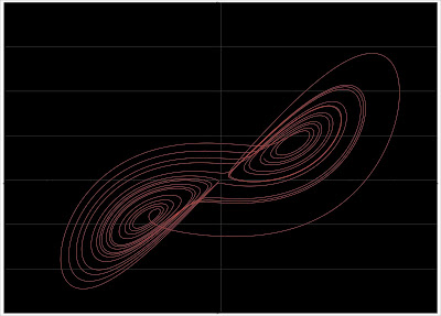
This form of attractor was called a "strange attractor". Although it occupies a finite volume of phase space, the trajectory from any arbitrary point would evolve in unique fashion, so that all evolving trajectories from any arbitrary starting point would appear similar, yet would occupy subtly different regions of phase space.

Multiple equilibria (multistability)

In some complex systems, we observe any number of disjoint Lyapunov-stable areas (LSA), each separated in phase space by a separatrix [Kauffman, 1993]. At any given time, the state of the system occupies only one such LSA, so that their number therefore constitutes the total number of alternative long-term behaviors, or equilibrium states, of the system. Since an LSA is likely to be smaller than the total allowable range of states, the system tends to become boxed into an LSA unless it is subjected to external forcing. When the state approaches a separatrix, small perturbations can trigger a change to a nearby state (a bifurcation), resulting in chaotic changes in the evolution of the system [Parker and Chua, 1989]. Thus very complex behavior can arise in multistable systems.


Multistable behaviour generally arises from systems in which feedbacks, both negative and positive, impact a system which is perturbed by some sort of external forcing. Negative feedback tends to resist external forcing, resulting in stability in some regions of phase space. If the external forcing is sufficient to overcome the feedback, then positive feedback may actually accelerate the changes, causing the state to evolve rapidly towards another area of stability.

The smooth variation of one or more parameters in the system may result in a change in the type of or the number of attractors in the system, or even in the order in which the attractors are visited. Such a response is called a bifurcation. Bifurcations can represent a sudden transition within a system characterized by purely chaotic attractors to one with one or more LSA; between one LSA and multiple LSA; or between different configurations of LSA.

Bifurcations represent changes in the organization of the system, and their existence has been suggested by models [e.g., Ghil, 1994; Rahmstorf, 1995], and more rarely from observations [Livina et al., 2010; discussed here]  in future installments we will demonstrate such behaviour in natural systems. Initially, however, we will concentrate on interpretation of some of the phase space portraits presented last time.

References


Ghil, M. (1994), Cryothermodynamics: the chaotic dynamics of paleoclimate, Physica, 77D: 130-159.

Kauffman, S. (1993), The Origins of Order: Self-Organization and Selection in Evolution, Oxford Univ. Press, New York, 734 p.

Livina, V. N., Kwasniok, F., and Lenton, T. M. (2010), Potential analysis reveals changing number of climate states during the last 60 kyr. Climate of the Past, 6, 77-82, doi: 10.5194/cp-6-77-2010.

Parker, T. S. and L. O. Chua, (1989), Practical Numerical Algorithms for Chaotic Systems, Springer-Verlag, New York.

Rahmstorf, S. (1995), Bifurcation of the Atlantic thermohaline circulation in response to changes in the hydrologic cycle. Nature, 378, 145-149.

Wednesday, October 26, 2011

Snapshots of economic crises in phase space

Part 3 of inference of dynamics is delayed as for some reason I can't open the post and edit.

Today we look at the monthly change in net foreign purchases of US long-term securities. Data comes from the US Treasury site. By net foreign purchases they mean the difference between foreign purchases of US long-dated securities and US purchases of foreign securities.


What I found most surprising is the negative bias. In this chart, a negative number means US purchases of foreign long-dated securities exceeds foreign purchases of US long-dated securities. We note the negative bias becomes quite pronounced beginning in the early '90s (wasn't this the era of the US strong dollar policy?)

The plot below is a reconstructed phase space in two dimensions, using the monthly change in net foreign purchases of US securities, expressed as a percentage, and smoothed by a three point moving average.


What we are looking at is a measure of policy responses to economic crises of the last 30 years. Two things really leap out at me: 1) the size of the response to the Russian crisis in early 1998, which arguably led to the collapse of Long Term Capital Management; and 2) where is the great 2008/2009 crisis?

The net change of about 13000% in a single month reflects foreigners dumping US bonds and the US buying foreign bonds. The actual peak value is higher because I have plotted the phase space using a 3 pt moving average instead of the actual values to reduce noise. Of course the super-spike is so large that any noise has faded into the background.

Notice the straight lines from the tangle near the origin along the axes. It is rare to see straight segments in a phase space portrait--it tells us that the massive change happened over the course of a single observation. Imagine what must have happened to a heavily levered player in such an environment? Well, we hardly need to imagine

Looking at the last few years, we see the following.


I'm not sure what was going on in late 2005, but the last big crisis had a sudden (albeit small) response.

Since these are percentage changes, it could be that before the 2008-9 crisis really took off there was already a lot of net selling of US long treasuries, so the spike does not appear so impressive.

In conclusion--it looks like the Russian crisis caught monetary authorities by surprise, leading to an enormous response.

Saturday, October 22, 2011

Inference of dynamics for complex systems part 2

Phase space portraits

As we left our last installment we had the problem of a series of observations from some interesting system, and we were seeking a means of understanding it. First of all, however, we had some doubts as to whether the measurements we have made will tell us anything about the system, or whether there will be other information needed in order to make any useful inferences.


Approaches to studying dynamic systems include both qualitative studies of the general trends of a system and quantitative studies in which invariant properties of the system are evaluated [Abarbanel, 1996]. System dynamics are evaluated by reconstructing the system’s phase space, which is a geometrical representation of the system projected in a “space” created of different variables [Packard et al., 1980; Abarbanel, 1996]. The climate system can be described by a phase space with coordinates x1, x2, x3, . . . xn, and the functions x1(t), x2(t), x3(t), . . ., xn(t) (the outputs of the system). As time (t) varies, the sequential plot of points of coordinate {x1(t), x2(t), x3(t), . . ., xn(t)} describes the time evolution of the system in phase space.

The number of output functions (n) is called the embedding dimension [Sauer et al., 1991]. The evolution of the system is marked by the trajectory traced out by sequential plots of individual states with coordinates defined by the values of the n functions at each observed time. Describing the trajectory of the system as it flows through phase space is a qualitative means of characterizing the dynamics of the system. The system may also be characterized quantitatively in terms of its invariant properties, such as the Lyapunov exponents and the correlation dimension of the system, which can be calculated from the phase space portrait [Abarbanel, 1996].

Phase space from multiple time series

How do we select the coordinates? One method is to create a phase space by plotting scatterplots of several different records which have been sampled at the same time intervals. For instance, Saltzman and Verbitsky [1994] created a phase space using, as variables, ice mass, ocean temperature, and atmospheric CO2. The state of the system is defined by its location in phase space at a particular time. The plot of successive states through time traces out the trajectory of the system. Traditionally the trajectory is constructed by drawing a curved line, rather than straight line segments through the states in sequence.


The drawback with the Saltzman and Verbitsky approach in paleoclimate is that is difficult to find many records that have been sampled at the same intervals. You are restricted to the portion of the geologic record covered by the shortest record. Additionally, there are errors in both magnitude and time.

Let's not worry about interpretation yet. Today is only about basic methodologies.

Economic systems can quite profitably be studied using this approach, mainly because there are so many of them, the errors tend to be small (except see here), and the timing is usually well constrained as well. So we can compare US unemployment rate to interest rates, for instance.


Data from BLS site.

Commonly we might look at observations like the one above, and not draw the trajectory (the curve that runs sequentially through the data). Instead, a traditional approach might have been to draw a line of best fit in the hopes of defining a correlation. In looking at the above figure, we see two clusters of observations. Past experience tells us it is risky to define a line of best fit using the traditional methods in this way, as the result is heavily weighted by the line between the centres of each cluster.

Similarly we can look at the average duration of unemployment vs unemployment rate.


Data from BLS site.

Or unemployment rate (vertical axis) vs monetary measures.


Data from BLS and St. Louis Fed site.

Or house prices vs real interest rates.


Data from Shiller [2005].

Defining a phase space from multiple variables requires multiple records. The state space can only be characterized over the duration of the shortest record. Dating errors will lead to various forms of distortion in the projected phase space. The economic time series tend to lend themselves well to this form of projection, because many of them exist to any arbitrary level of precision. If you choose month-end or year-end prices, there are normally no dating errors.

Phase space from a single time series

It is pretty uncommon to have more than one geological time series of sufficient length with good dating control. So geologists will normally have to work with a single time series. The method below can similarly be used in other types of time series as well.

When you have one time series, you may wonder how much dynamic information it contains. Fortunately, ergodic theory suggests that dynamic information about the entire system is contained in each time series output from the system [Abarbanel, 1996]. Therefore, a phase space portrait reflecting the dynamics of the entire system may be reconstructed from a single time series.

Time-derivative method

Packard et al. [1980] propose a method in which the function is plotted along one axis, and its various time derivatives are plotted on the other axes. If we use the simplest two-dimensional case, the graph would consist of a scatterplot of the function against its first time derivative. (i.e. y vs. dy/dt). An example of such a plot appears on the masthead of the blog.


In the above figure, we see the ice volume proxy plotted on the horizontal axis (ice volume increases towards the right) plotted against its first derivative over an interval of time lasting about 120,000 years. The numbers on the graph represent the time in thousands of years before present (ka BP). The rate of change of ice volume is plotted with +ve on top, so that as global ice volume grows (near A, for example), the system will move towards the right through phase space.

Any equilibria in this type of figure must necessarily occur along the zero rate of change axis.

Note the error bars presented on some of the states. Similar error bars would be found at all other states in the figure as well. The error in estimating the rate of change is a consequence of the error in measurement being similar in size to the difference between successive measurements. The size of the error bars is large compared to the variability of some parts of the trajectory--consequently our confidence in this trajectory is not as great as it otherwise might be.

Time-delay method

We reduce these errors by reconstructing the phase space by the time delay method [Packard et al., 1980], in which the elements of a time series are plotted against n-1 lagged observations from the same series (figure 2B). Identifying the lags and the embedding dimension (n) are key decisions in the reconstruction. To simplify things in the following discussion we shall only use two dimensions. Thus we reconstruct our phase space portrait by a scatterplot of the data against a lagged copy of itself. The optimum lag is defined by the first minimum of the average mutual information function [Fraser and Swinney, 1986]; however for quasiperiodic data we find that this tends to be the first minimum of the autocorrelation function (about ¼ of the period of the dominant waveform).

Thus for ice volume:


Here we are looking at a two-dimensional phase space reconstructed from ice volume proxy data covering about 200,000 years. In this projection, lower glacial ice volume is at the lower left corner of the plot, with greater ice volume towards the upper right corner. We'll interpret these later. Moving on


Case-Shiller index


Official unemployment rate


Detour Gold Corp.


CNTY busted trades (1 s of trading activity each figure)


Gold-silver ratio in phase space

Dynamic systems, like climate, have historically been analyzed using power spectral methods, such as the Fourier transform and wavelet analysis [Hays et al., 1976; Imbrie et al., 1992]. This has been a reflection of the predominantly linear assumptions underlying early analytical methods.

The power spectrum is not an invariant property of a nonlinear time series [Abarbanel, 1996], meaning that significant changes may appear in the power spectrum despite the lack of changes in the dynamics of the system. Therefore, changes in power spectrum are insufficient evidence to infer changes in dynamics.

In our next installment we'll talk a bit about equilibrium and what any of the above plots have to say about it.

References

Abarbanel, H. D. I. (1996), Analysis of Observed Chaotic Data, Springer-Verlag, New York.

Fraser, A. M., and H. L. Swinney (1986), Independent coordinates for strange attractors from mutual information, Phys. Rev. A, 33, 1134-1140.

Hays, J. D., J. Imbrie, and N. J. Shackleton (1976), Variations in the Earth’s orbit: Pacemaker of the ice ages. Science, 194, 1121-1132.

Imbrie, J., et al. (1992), On the structure and origin of major glaciation cycles, 1, Linear responses to Milankovitch forcing, Paleoceanography, 7, 701-738, 1992.

Packard, N. H., J. P. Crutchfield, J. D. Farmer and R. S. Shaw (1980), Geometry from a time series, Phys. Rev. Lett., 45, 712-716.

Saltzman, B., and M. Verbitsky (1994), Late Pleistocene climatic trajectory in the phase space of global ice, ocean state, and CO2: observations and theory, Paleoceanography, 9, 767-779.

Sauer, T., J. A. Yorke and M. Casdagli (1991), Embedology. Journal of Statistical Physics, 65, 579-616.

Shiller, R. J. (2005), Irrational Exuberance, 2nd ed., Princeton University Press.

Wednesday, October 19, 2011

Inference of dynamics for complex systems, part 1

Today I will start over with the analysis of dynamic systems, describing a methodology and some of the rationale behind the interpretations from previous postings, as it occurs to me that all of this stuff, though discussed before, is buried in the archives and is not easy to pull together.

This will also be good for me as I have to put together some kind of paper on the topic for one or more conferences in the first half of next year. GAC, in St. John's next year, will be a given as it is my old alma mater, but I am giving thought to presenting at the upcoming 3rd Multiconference on Complexity, Informatics and Cybernetics.

You are studying an interesting system, with many components. You know that many of the components interact, but you don't know the details of their interaction. If the interactions vary with changing conditions  within the system (feedback) it may be described as a complex adaptive system. Examples of such systems include, but are not limited to, ecosystems and other biological systems, the stock market and other economic systems, the climate system, and some would argue, the entire earth system.

The behaviour of such systems is typically nonlinear, and typically characterized by self-organization and emergent phenomena. The presence of negative feedback gives the system a form of resilience, allowing it to resist perturbations; and the presence of positive feedback causes the system to experience episodes of rapid change, usually resulting in a shift from one equilibrium condition to another. Multistability (the presence of more than one equilibrium condition) is a common feature of such systems.

The system has input signals, which may be time-dependent, however it may be that you are only able to observe some of these signals; furthermore there may be input signals of which you are unaware. There are output signals, which you observe, and compile into one or more time series; however there is no way to know if your output signal is important in terms of developing a global understanding of the system of interest.

There are conditions within the system which influence the manner in which the input signals feed through to the output signals. You may have an inkling of some of these rules (commonly expressed as differential equations) but normally your understanding of these rules is incomplete. You hope to understand your system by deducing these equations on the basis of your observations.

Here are some examples of systems we may wish to study.


Daily closing prices for Detour Gold Corp. (DGC-T), from late November 2009 to October 2011.


Gold-silver ratio.


Case-Shiller index. Data from Robert Shiller data page.


Unemployment rate (from US BLS site).


Trading activity in Century Casinos, June 21, 2011. From Nanex.


Paleoclimate proxy records over the past two million years. Magnetic susceptibility of loess (proxy for Himalayan monsoon strength) at top. Deep water 18-O record (proxy for global glacial ice volume) at bottom.

At first glance, the problem seems insurmountable. How do you study a system when you can't even be sure that your observations are meaningful? What if you have failed to observe the most important observable parameters?

It is especially bad for the geological time series, for in addition to the above problem, there are both errors in measurement and errors in the date (or time) of each observation.

In future installments, we will work through the data sets shown above; but we will start with some thoughts on equilibrium.

Tuesday, October 18, 2011

Excursion in silver price (relative to gold) projected to end this month

Then it will be back to the old grind.


For the above figure I have used a simple 3 pt moving average of the ratio of the month-end prices for gold and silver. The lag is twelve months. The projected point, which is back in the green area that has largely characterized the gold-silver ratio system over the past fifteen years, is based on today's (actually yesterday's closing prices).

Assuming that the gold-silver ratio does not change before the end of the month, we will be back in the green area.

To avoid this return, we would need the gold-silver ratio to fall to about 46 by the end of this month. At the present gold price, we would need to see a silver price of about $35. Not impossible, but time is running out.

Disclosure: long silver, long gold.

Monday, October 17, 2011

Boys, boys, boys . . . (updated)

. . . don't worry overly much about the tsunami that has been forecast to join the Occupy Wall Street movement.

The idea that one or more of the Canary Islands will suffer some sort of catastrophic failure due to a volcanic eruption causing an enormous landslide that will generate a tsunami sufficient to devastate eastern North America, Europe, Northwest Africa and parts of South and Central America has been around for some time.

Although the USGS is well aware of the possibility, and has carried out some preperatory work in terms of planning, there are a number of factors to consider in the risk assessment of such an event.

First of all, the video below is complete bullshit.


I don't doubt the sincerity of those who promote this idea, but there are two basic problems with the premise.

Although it is true that landslides create large tsunami--in fact the largest tsunami on record (Lituya Bay) and the largest tsunami ever inferred from the geological record were both generated from landslides. The problem is that none of these events have ever generated the so-called teletsunami--one that crosses the ocean to wreak havoc on the other side.

A major part of the reason has to do with the geometry of the source. For a tsunami to travel long distances, it has to have been formed from a long, linear source. If the source of the tsunami is a point, as is the case for submarine volcanism or landslides, then much of the energy is dispersed along the rapidly expanding front of the wave as it moves away from the source. Further dissipation occurs as the wave crosses seamounts, all of which act to reduce the impact of such a wave as it crosses the ocean.

Consequently, the tsunami generated from submarine earthquakes (usually in subduction zones) start off smaller than landslide-generated earthquakes, but there is little dispersion of energy as the leading edge of the wave does not much lengthen as the wave crosses the ocean. There are numerous examples of large subduction earthquakes generating tsunami which crossed the ocean with enough force to cause severe property damage and casualties, including in the Indian Ocean in 2004, and Hawaii in both 1946 (source-the Aleutian Islands) and again in 1960 (source-Chile).

Geologists have been able to infer that such teletsunami have occurred in the past, on the basis of certain types of deposits, and, in some cases, the historical record. The geologic record goes farther than the historical record, and necessarily forms the basis of much risk assessment in areas prone to tsunami.

Volcanic islands have generated very large tsunami in the geologic past. The Hawaiian Islands are notorious for them. Despite their much larger initial height than earthquake-generated tsunami, there are yet to be any discoveries of tsunami deposits around the edge of the Pacific basin that can be tied to the Hawaiian landslides.

The only geological evidence for a teletsunami generated from a point source that I am aware of is the (still controversial) interpretation of some units in the Brazos River Sandstone in Texas as a result of the Chicxuclub asteroid impact at the end of the Cretaceous. The distance between the impact and the tsunami deposits is considerably less than the distance between the Canary Islands and North America--furthermore the energy provided by the bolide impact is orders of magnitude larger than would be expected from a Canary Islands landslide.

The second serious problem with the Canary Island megatsunami idea is that the collapse of a very large mass of rock is not likely to occur as a single impulse. The events are usually complex, characterized by multiple episodes of failure over a period of minutes to hours to days. The models usually assume a single impulse, which generates the most devastating results (and possibly results in greater funding opportunities). A more realistic model would generate a much smaller and more complex series of waves, the energy of which will disperse as the wave crosses the Atlantic as discussed above.

This is not to say that there is no chance whatsoever for damage on the eastern seaboard--it is just grotesquely exaggerated.

However--as local phenomena, these landslide-generated tsunami are enormous, and can cause tremendous damage locally. Thus, I would not argue with the decision to evacuate portions of the Canary Islands, as the swarm of earthquakes does suggest an imminent risk, and it would be impossible to evacuate in response to an event--it would hit too fast and too hard. But the risk level for North America is low.

-  -  -  -  -  -  -  -  -  -  -  -  -
Update (October 21)

This is an abstract from Geochemistry, Geophysics Geosystems Journal (AGU) of an in-press paper (meaning that as of this writing it is not yet ready for purchase). The key point is that large, possibly tsunamigenic landslides in the Canary Islands tend to occur in stages, often separated by days. This would greatly reduce the size of the resulting tsunami.


GEOCHEMISTRY GEOPHYSICS GEOSYSTEMS, doi:10.1029/2011GC003740

Sedimentological and geochemical evidence for multistage failure of volcanic island landslides: a case study from Icod landslide on north Tenerife, Canary Islands

James Edward Hunt
Russell Wynn
Douglas Masson
Peter Talling
Damon A.H. Teagle

Volcanic island landslides can pose a significant geohazard through landslide-generated tsunamis. However, a lack of direct observations means that factors influencing tsunamigenic potential of landslides remain poorly constrained. The study of distal turbidites generated from past landslides can provide useful insights into key aspects of the landslide dynamics and emplacement process, such as total event volume and whether landslides occurred as single or multiple events. The northern flank of Tenerife has undergone multiple landslide events, the most recent being the Icod landslide dated at ~165 ka. The Icod landslide generated a turbidite with a deposit volume of ~210 km3, covering 355,000 km2 of seafloor off northwest Africa. The Icod turbidite architecture displays a stacked sequence of seven normally graded sand and mud intervals (named subunits SBU1-7). Evidence from subunit bulk geochemistry, volume, basal grain size, volcanic glass composition and sand mineralogy, combined with petrophysical and geophysical data, suggests that the subunit facies represents multistage retrogressive failure of the Icod landslide. The basal subunits (SBU1-3) indicate that the first three stages of the landslide had a submarine component, whereas the upper subunits (SBU4-7) originated above sea level. The presence of thin, non-bioturbated, mud intervals between subunit sands suggests a likely time interval of at least several days between each stage of failure. These results have important implications for tsunamigenesis from such landslides, as multistage retrogressive failures, separated by several days and with both a submarine and subaerial component, will have markedly lower tsunamigenic potential than a single-block failure.

Friday, October 14, 2011

How government spending impoverished us all

A few weeks ago we discussed the growth of the "virtual" economy. The argument was that metal consumption (in particular copper and zinc) grew in accordance with global GDP until the mid '70's, after which metal consumption grew markedly more slowly than did global GDP. Our thesis was that global GDP (the "official" economy) has at least partially increased by management of perceptions and addition of a lot of economic "activity" which does not increase wealth.

It has troubled me in the past that I could file lawsuits against present and past associates, who in turn might file suits against me. In the very best scenario all that would happen is a redistribution of existing wealth, yet all the legal fees would be additive to GDP. Yet no wealth would be created (except from the lawyers' perspective) and a great deal would be lost. It has always seemed to me that economic activity of this type forms a component of GDP the magnitude of which is unknown.

A reader questioned whether the reduction in growth of consumption of these metals could be due to their replacement by less expensive alternatives. Although I believe that there may be a slight effect, as seen in relative increases in aluminum and stainless steel--I discount most of this because copper, for many of its applications, is very difficult to replace. It is why the price of Dr. Copper is thought to be such a good leading indicator for the economy.

Today we add nickel and steel to our graph, but instead of plotting them against GDP, we plot the ratio of their consumption to global GDP (all scaled to 1 at far left, in 1949).


What we are actually looking at is the relative growth in the amount of metal consumed in comparison to the growth of GDP. If the curve is level, then metal consumption is growing (or shrinking) at the same rate as global GDP. If the curve rises towards the right, then metal consumption is growing faster than global GDP. If the curve descends towards the right, then metal consumption is growing more slowly (or shrinking faster) than GDP.

We see clearly that the consumption of metals has not kept pace with GDP, with most of the relative decline happening after 1975.

At the World Complex, I view metal consumption as being a better indicator of economic activity than the officially reported GDP. Perhaps I should say I trust the metal consumption numbers more, as I suspect they are harder to fake. In any case, metal consumption usually involves making something, which is frequently accretive to wealth (except in the case of bombs, et al.).

The decline in metal consumption is a direct measure of the decline of real wealth. Yes, real wealth is not dollars, it is oil; it is copper; it steel. As long as the per capita availability of these resources is increasing, our wealth is increasing. I have argued in the past that the suppression management of commodity prices is largely responsible for comparatively recent declines in their per capita availability.

Has the definition of GDP changed over the last fifty years? According to wiki, it is defined as follows:

GDP = C + I + G + (X - M)

where C is private consumption, I is gross investment, G is government spending, X is exports, and M is imports. There hasn't been any change in the definition over the past sixty years. But here is something that has changed.


US Federal spending compared to GDP. The magnitude of spending really takes off after about 1970.

Now this is true for the US, but probably mirrored to some extent in other countries as well.

The problem is not a change in the way the GDP is defined--the problem is in the definition of GDP itself. If we want GDP to be a measure of wealth then we need to remove that G term--or part of it.

A tonne of copper can't be consumed until it is produced. But the government can spend money that it doesn't have. So government spending can't be part of what was produced by a country unless it has been covered by taxation--then at least the wealth was produced prior to consumption. If the spending is empowered by debt creation, then no production was involved.

It's like measuring the wealth of a family by counting the money they spend, with no regard as to whether they are piling up credit card debt.

The miscalculation of GDP is useful to TPTB because it creates an illusion that we are wealthier than we really are. Ph.D. economists can't perceive this truth if they want to keep their funding.

Perhaps in addition to occupying Wall Street, protesters should give some thought to occupying the White House, Congress, and the Senate.

Wednesday, October 12, 2011

Take the test: See what kind of terrorist you are (Canadian edition) - updated

Fintrac puroports to protect us all.

Test is available here.* Sorry if you love animals or trees. A partial screenshot appears below.


We're not distrustful of the government on this blog, nosiree!

*Update: Strangely enough, the site seems to have been taken down or had its address changed. If I can find it (if it still exists) I will post a new link.

Update 2. The missing page has not reappeared. But there is this.

Tuesday, October 11, 2011

How do I know if my currency is "misaligned"?

A new bill up for debate in the US called "The Currency Exchange Rate Oversight Reform Act of 2011" proposes to fix the US economy by punishing all countries whose currencies are "fundamentally misaligned" (read: manipulated), presumably with respect to the US dollar.

Among the promises of this bill, it also . . .
Establishes New Objective Criteria to Identify Misaligned Currencies
Well, that's dandy! I would like to know something about these criteria, however. For instance, in the summary of the bill, there is a link to this article (apparently for support), which states:
First, the United States must, in effect, weaken the dollar by 10 to 20 percent.
It is not clear to an objective reader how this differs from the other currency manipulators presumably targeted by this bill.

I also remind you that these new objective criteria will be used by the same blundering fools who failed to identify the housing bubble.

Monday, October 10, 2011

How a housing bubble looks (in phase space)

On Canadian Thanksgiving Day, let us give thanks that Alan Greenspan and Ben Bernanake are not Canadian.

Today we present a plot of the Case-Shiller index (an inflation-adjusted index of US house prices) against US real interest rates over the past 60 years.

Inflation data from this site. The other data came from Robert Shiller's data site.


Unlike the last plot, the real interest rate here was based on the difference between the long rate (reported in the Shiller data file) and the CPI (reported on the inflation site above).

These guys blew a bubble of astounding proportions.

The key feature I think is that in the absence of the bubble, we see only a slight negative correlation between real interest rates and the house price index. I do question that odd-looking spike in the early '70's. Perhaps there was a real lag in house prices as inflation first began to take off.

There is a small bubble which peaked in 1989, followed shortly by an impressive excursion through phase space from about 1999 to present. Unfortunately, no respectable economist could recognize that any unusual behaviour was occurring. It certainly wasn't a bubble.

Using the methods described here, we can produce reconstruct the two-dimensional phase space to show how unusual the recent behaviour in home prices has been.


Since 1894, we recognize two areas of stability in the Case-Shiller index, highlighted in orange. The entire record is spent either in them, or shuttling between them, until the breakout in the year 2000.

In retrospect, it was fair to say in 2002 that a bubble in housing was apparent. Certainly it was a bit of an excursion in phase space. But by 2005 it should have been obvious even to a Ph.D. (and yes, I have one) that a bubble was in progress. Perhaps Bernanke et al. were all hoping that the system would start tracing out a new area of stability somewhere nearby. If so, it was a vain hope.

Sad to say, the only reasonable prospect is for a return to the larger area of Lyapunov stability. If you are really unlucky, perhaps you will fall to the smaller one. The good news is that the process probably won't take more than about five years.

Lest I sound like a smug Canadian, let me state here that I acknowledge we have a dandy housing bubble of our own.

Thursday, October 6, 2011

Wanted: more nuanced economic hammers

A little over a year ago we were treated to this article, suggesting that the Wise, All-Knowing Bearded One would bring us to a land of low unemployment via the harsh medicine of low interest rates. Now it's true that The World Complex has already hit this particular piece of low-hanging fruit, but I thought it worth a look to review how the plan is unfolding.


Yes, yes, we've seen this before. How do we explain what went wrong?

Askari and Krichene (in the paper at top) report that the US Fed reduced interest rates in order to preserve employment. Assuming this is a correct assessment of the Fed policy, we need to consider why it does not appear to have worked.

The alarming picture above appears to be a system displaying the property of multistability. Multistability is a concept related to that of equilibrium--except that unlike simple systems with only one equilibrium point, multistable systems have more than one (some authors use the term bistable to describe systems with two equilibria, and multistable for three or more. We shall use multistable to describe any system with more than one equilibrium state).

Multistability is a property of a system, which is neither completely stable nor unstable, but shifts from one stable state to another, at regular or irregular intervals. A short search for systems that display multistability yields living systems, neural networks, some control systems, and global climate subsystems. To this list I would add the unemployment/real-interest-rate system (and stock prices--and commodity prices--and the unemployment/money-creation system--and probably numerous other economic subsystems).

When you have a system with more than one equilibria--as in the unemployment rate/real-interest-rate system illustrated above, your ability to control which equilibrium you enter is limited. For instance both equilibria in the graph at top are characterized by low real interest rates. So how do we make sure the economy evolves towards the equilibrium with low unemployment, rather than the one with high unemployment?

A characteristic of multistable systems is memory. The equilibrium occupied at any particular time is dependent on the entire past history of the system. This makes control a tricky matter.

Are economists aware of the possibility of multistability? The Fed policy described above would suggest no, but the truth may be more nuanced. From a mathematical standpoint, it is very difficult to create a system of equations to describe a system with multistability. It is more likely that the equations will describe a system with a single equilibrium. If this system is used to inform policy, then that policy will be of the simplistic "press button A, bell B rings" type.

Perhaps economists are unaware of multistability. Perhaps they are aware of multistability but are unable to account for it through systems of equations and so use 'fudge factors' to explain why the equilibrium point moves around. Or perhaps they are fully aware of it and can explain it through their equations, but these explanations are so complex that no trace of them ever appears in the public record of their activities.

In any event, their policy, as reported, does not appear to be having the desired effect. Perhaps it is time to use a tool more delicate than a hammer. If a solution isn't found, the US may become New Europe.

Wednesday, October 5, 2011

As the impacts of NI 43-101 regulations flow through the system, gold companies may be revalued

There are many opinions about the value of gold in the ground, some of which have changed through time.

As people become more familiar with the NI 43-101 regulations, investors have come to distinguish between resources, proven reserves, and measured and indicated ounces. As a consequence, company prices no longer react much to raw results; investors now wait to see the result of a formal technical report to see if more ounces are discovered or upgraded to proven reserves.

The value of gold and the ground will depend on the price of gold. For some of the examples above, the value of proven and probable reserves was set at about one-quarter to one-fifth of the spot gold price. Other authors place a lower value on such gold.

There is a problem with the model for gold exploration. There does not appear to be enough money in it to make it worthwhile.

Value of gold discovered per dollar of exploration through time. 

In the face of a rising price of gold, the payback on gold exploration appears to have fallen alarmingly. The idea that an exploration company's price will rise tenfold on a discovery may have been valid forty years ago, but with the level of success indicated on the above table, such a payback would leave nothing for the poor developer of the eventual mine.

It is possible to infer from this chart that we are running out of gold to discover. Here at the World Complex, our view is that a significant factor in this decline is the increased level of regulatory complexity a company must navigate in order to officially "discover" an amount of gold. In particular, the amount of drilling required to define one million ounces of gold is much greater at present than was the case in, say, 1960.

Ultimately, the extra money is not wasted. The additional definition of the resource may not have been necessary to "prove" the deposit in years past--but it would have been done to define the reserve during the planning stages of the mine. So the effect of recent regulation has been to shift some of the spending burden from the mine developers to the junior explorers.

In effect, the increase in cost defining resources is mitigated somewhat in the development phase. In principal, it should cost slightly less to develop a mine after the definition of the mineral reserve than would have been the case in the distant past, suggesting a net benefit to developers and producers. I have not pulled together enough data to study whether the share price of producers has improved with respect to typical metrics (reserves or production) to see if this shift can be separated from the impact in the rising price of gold.

It may be that there is another revaluation to come for mining companies.

Tuesday, October 4, 2011

You must remember what Keynesians forgot

One characteristic of time series that we have been able to study through reconstructed phase spaces is the concept of long memory. In principle, the future evolution of the state of a complex system is dependent on the entire past history of the system.

The prescriptions of Keynesianism in modern economics ignores the long memory of the system. Keynesians believe that application of policy A brings about response B. In a system with long memory, the response is also dependent on the previous history of the system--hence lowering interest rates in 2011 does not bring about the same response as lowering them in 2001--because the history prior to 2011 differs from history prior to 2001.