
Perhaps you haven't noticed, but at The World Complex, we like gold. A lot. Not too long ago we ran an article about historical gold production, with some estimates of future production for gold. Today we will take a closer look.
It turns out that my main professional activity is exploring for gold, and yet that isn't why I spend so much time thinking about it.
I began this blog to investigate application of mathematical methodology to geologic problems. Over the last year in particular, I have put increasing effort into using the same tools to look at economic problems. Yet ask geologists why they spend so much time looking for gold, and you will get many answers, none of them true.
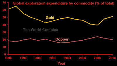
In terms of exploration effort, gold is the most important mineral on the planet. Approximately 50% of all money spent on non-fuel mineral exploration during the last fifteen years was spent on gold exploration.
Sources here, here, and here (unfortunately the last two require a paid subscription).
I think people are mystified by the intense effort to find gold. Comments on gold at popular economic sites are polarized between those who find gold to be the most important commodity in the world and those who think it useless.
What does the USGS say about it?
Copper is the second most important mineral--and at about 20% of global exploration expenditure, a distant second at that. Silver doesn't even appear on the scale.
Now let us look at the size-distribution of some known gold deposits. I will use the same approach used here to look for evidence of self-organization in the size of gold deposits. This article suggests that gold deposits exhibit scale-free behaviour. Let's investigate.
NRH Research has published a list of 296 deposits consisting of one million or more ounces of gold here. Although I haven't checked all the numbers, the ones I did check show some minor differences--mainly due to additional work carried out on the project since the date of the report. The only substantial issue is that for some of the deposits checked it appears that NRH has summed reserves, measured and indicated resources, and inferred resources; but not always. Rather than go through and update all 296 deposits, I have decided to use the data as is. Caveat emptor.
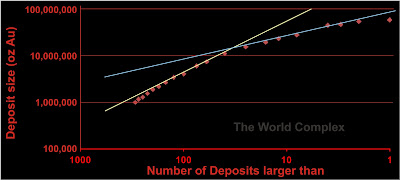
The Chinese article cited above suggests that gold deposits are scale-free, meaning that if we plot them as we did the wealth distribution last week, we should see a straight line: however, we won't observe this because we have failed to discover all gold deposits. As a result, the graph will be concave downwards, reflecting possibly large numbers of yet-undiscovered gold deposits, particularly small ones.
On our graph is indeed concave downwards. The blue and yellow lines represent potential scenarios by which we may estimate how much more gold there remains to be found. Both suggested lines cover approximately one order of magnitude, however I believe the yellow line to be unrealistic, as it would suggest that there remain many very large deposits to be found--and projecting it all the way to the right would suggest one deposit larger than a billion ounces remains to be found!
The blue line would not permit much more in the way of large deposits, but would suggest that a great many smaller deposits are yet to be found. For instance, in the NRH report, there are 100 deposits larger than about 4 million ounces. From the blue line we would infer about 300 deposits larger than 4 million ounces. Two hundred more to go!
It may seem fantastic, but one thing to remember is that virtually all gold deposits ever discovered outcrop at surface. We are only just learning how to discover deposits that don't outcrop at surface. There's a lot of underground that hasn't been explored yet, so it's be fair to say the planet Earth is still an immature exploration district.
It turns out that my main professional activity is exploring for gold, and yet that isn't why I spend so much time thinking about it.

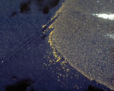
Gold in a rubber pan, from an artisanal mining operation on a ridge in central Ghana.
The photo is about 4 cm across IIRC.
I began this blog to investigate application of mathematical methodology to geologic problems. Over the last year in particular, I have put increasing effort into using the same tools to look at economic problems. Yet ask geologists why they spend so much time looking for gold, and you will get many answers, none of them true.
In terms of exploration effort, gold is the most important mineral on the planet. Approximately 50% of all money spent on non-fuel mineral exploration during the last fifteen years was spent on gold exploration.

Sources here, here, and here (unfortunately the last two require a paid subscription).
I think people are mystified by the intense effort to find gold. Comments on gold at popular economic sites are polarized between those who find gold to be the most important commodity in the world and those who think it useless.
What does the USGS say about it?
Gold is by far the most explored mineral commodity target among those analyzed and the principal target for about 580 sites in 1995 and 1,800 sites in 2004. Gold’s popularity can be attributed to its demand in aesthetic and technological applications, its profitability (in terms of revenue minus costs), its widespread geological occurrence in relatively small deposits, some of which can deliver a high rate of economic return on investment, and its high price per unit weight. (Wilburn, 2005)To paraphrase--it's beautiful; profitable; and it scattered in small deposits worldwide. Rather than delve into the economic importance of gold, for now let us have faith that the market allocates investment as it does for a logical reason, whatever it happens to be. Based on exploration effort, gold is the most important non-fuel mineral in the world.
Copper is the second most important mineral--and at about 20% of global exploration expenditure, a distant second at that. Silver doesn't even appear on the scale.
Now let us look at the size-distribution of some known gold deposits. I will use the same approach used here to look for evidence of self-organization in the size of gold deposits. This article suggests that gold deposits exhibit scale-free behaviour. Let's investigate.
NRH Research has published a list of 296 deposits consisting of one million or more ounces of gold here. Although I haven't checked all the numbers, the ones I did check show some minor differences--mainly due to additional work carried out on the project since the date of the report. The only substantial issue is that for some of the deposits checked it appears that NRH has summed reserves, measured and indicated resources, and inferred resources; but not always. Rather than go through and update all 296 deposits, I have decided to use the data as is. Caveat emptor.

Size distribution of global gold deposits. Data from NRH report. Lines from my imagination.
The Chinese article cited above suggests that gold deposits are scale-free, meaning that if we plot them as we did the wealth distribution last week, we should see a straight line: however, we won't observe this because we have failed to discover all gold deposits. As a result, the graph will be concave downwards, reflecting possibly large numbers of yet-undiscovered gold deposits, particularly small ones.
On our graph is indeed concave downwards. The blue and yellow lines represent potential scenarios by which we may estimate how much more gold there remains to be found. Both suggested lines cover approximately one order of magnitude, however I believe the yellow line to be unrealistic, as it would suggest that there remain many very large deposits to be found--and projecting it all the way to the right would suggest one deposit larger than a billion ounces remains to be found!
The blue line would not permit much more in the way of large deposits, but would suggest that a great many smaller deposits are yet to be found. For instance, in the NRH report, there are 100 deposits larger than about 4 million ounces. From the blue line we would infer about 300 deposits larger than 4 million ounces. Two hundred more to go!
It may seem fantastic, but one thing to remember is that virtually all gold deposits ever discovered outcrop at surface. We are only just learning how to discover deposits that don't outcrop at surface. There's a lot of underground that hasn't been explored yet, so it's be fair to say the planet Earth is still an immature exploration district.


