
For today's installment we'll take a look at the debt:gold ratio for the PIIGS countries to see who puts the IG in PIIGS (perhaps you've already guessed).
I am using the same methodology used in these postings. The data come from the World Gold Council, the World Bank (albeit indirectly, for instance here), and here.
We'll start off with a look at the biggest of them--Italy.

And just for comparison's sake, here is the American plot, over a somewhat longer timeframe.

Once again--the ratio represents the multiple by which the country's debt exceeds its gold holdings. To an optimist, a high ratio means that the rest of the world has great confidence in the economy of the country in question. To a pessimist, a high ratio means the country is ruined.
At a quick glance, it appears that Italy is no worse off than America--assuming that both countries actually have the gold the World Gold Council claims they have. Italy may have trouble getting theirs from New York, if that is where it is.
Notice the decline in the ratio over the past decade--that is a reflection of the rising price of gold, not a decline in these nations' debts. Debt has increased over the past decade. The price of gold has apparently risen more. So does this mean these countries are becoming solvent? Can a rising price of gold solve our economic woes?
Historically, a decline in this ratio can been used by governments to justify monetary expansion, particularly if it happened during an episode of such expansion. Why not? The improvement of the ratio suggests that the government isn't printing enough. The destruction of the value of the currency (and the country's debt) begins to occur faster than the rate of monetary creation (thus the label in the US graph "Ben proposes, the Market disposes"). The government counters this by printing faster, but the destruction of the currency's value is faster still.
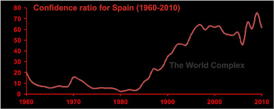
Here we see Spain. They aren't as well off as the Italians, but I've seen worse. Canada, for instance. Or Japan. And we'll see some others later.
We notice that the confidence ration hasn't declined that much for Spain in the last decade. A good part of the reason is that the Spanish sold off over half of their gold since 1998. However the Spanish were a little more shrewd than Gordon Brown--their biggest sale was in 2007, so it wasn't quite at the bottom. Still regrettable, though.

Now this is a county! I know where I'm relocating. It'll be convenient for getting to my various African projects too.
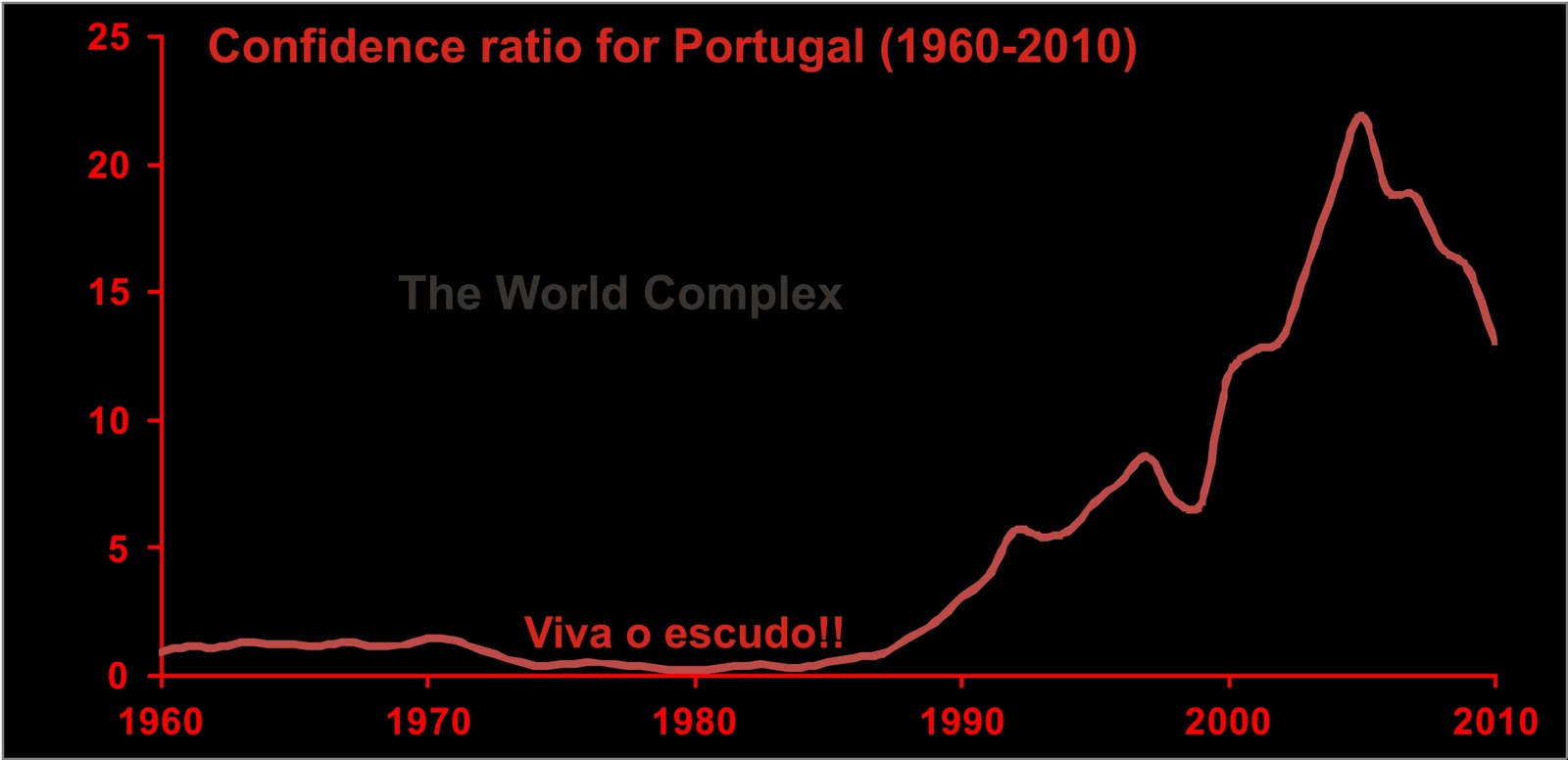
Why, why, why, oh why did Portugal let the escudo die? It looks like it might have been the greatest currency in the world in the 70's and 80's. Oh sure, the economy was small. But why do we think this is a country with serious economic troubles? Their only real problem is the fact that their gold is probably all in New York.
It's hard to believe, but there are PIIGS countries worse off than the US.
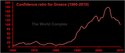
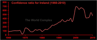
Here are our winners--the Irish and the Greeks. They are the IG in PIIGS.
The Greeks have been getting the bad press, but look at the Irish! Their problem is that they have never really had any gold. But who needs gold when you've got booming real estate?
Bad as things look in Europe, there are worse.

Stupendous! And it kind of makes Harper's recent boasting about Canada's solvency darkly humorous.
I am using the same methodology used in these postings. The data come from the World Gold Council, the World Bank (albeit indirectly, for instance here), and here.
We'll start off with a look at the biggest of them--Italy.

And just for comparison's sake, here is the American plot, over a somewhat longer timeframe.

Once again--the ratio represents the multiple by which the country's debt exceeds its gold holdings. To an optimist, a high ratio means that the rest of the world has great confidence in the economy of the country in question. To a pessimist, a high ratio means the country is ruined.
At a quick glance, it appears that Italy is no worse off than America--assuming that both countries actually have the gold the World Gold Council claims they have. Italy may have trouble getting theirs from New York, if that is where it is.
Notice the decline in the ratio over the past decade--that is a reflection of the rising price of gold, not a decline in these nations' debts. Debt has increased over the past decade. The price of gold has apparently risen more. So does this mean these countries are becoming solvent? Can a rising price of gold solve our economic woes?
Historically, a decline in this ratio can been used by governments to justify monetary expansion, particularly if it happened during an episode of such expansion. Why not? The improvement of the ratio suggests that the government isn't printing enough. The destruction of the value of the currency (and the country's debt) begins to occur faster than the rate of monetary creation (thus the label in the US graph "Ben proposes, the Market disposes"). The government counters this by printing faster, but the destruction of the currency's value is faster still.
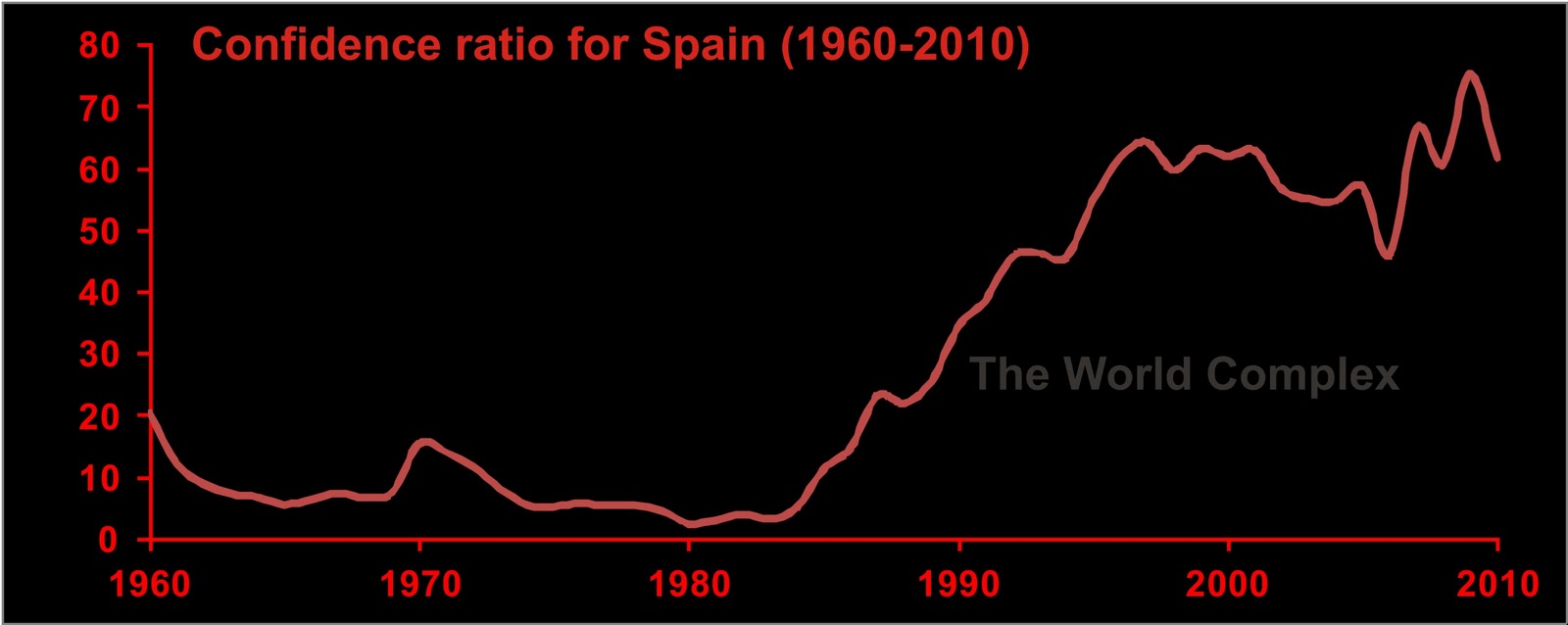
Here we see Spain. They aren't as well off as the Italians, but I've seen worse. Canada, for instance. Or Japan. And we'll see some others later.
We notice that the confidence ration hasn't declined that much for Spain in the last decade. A good part of the reason is that the Spanish sold off over half of their gold since 1998. However the Spanish were a little more shrewd than Gordon Brown--their biggest sale was in 2007, so it wasn't quite at the bottom. Still regrettable, though.
Now this is a county! I know where I'm relocating. It'll be convenient for getting to my various African projects too.
Why, why, why, oh why did Portugal let the escudo die? It looks like it might have been the greatest currency in the world in the 70's and 80's. Oh sure, the economy was small. But why do we think this is a country with serious economic troubles? Their only real problem is the fact that their gold is probably all in New York.
It's hard to believe, but there are PIIGS countries worse off than the US.

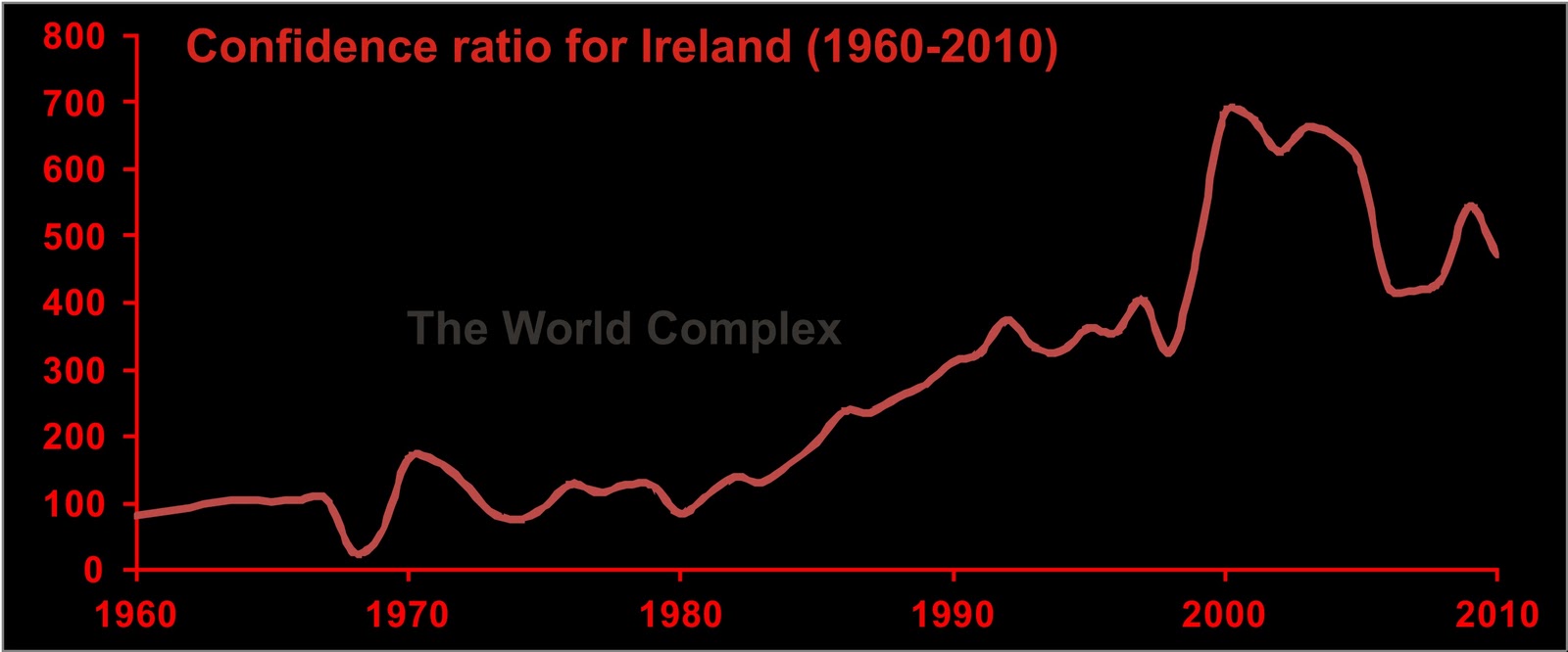
Here are our winners--the Irish and the Greeks. They are the IG in PIIGS.
The Greeks have been getting the bad press, but look at the Irish! Their problem is that they have never really had any gold. But who needs gold when you've got booming real estate?
Bad as things look in Europe, there are worse.

Stupendous! And it kind of makes Harper's recent boasting about Canada's solvency darkly humorous.


